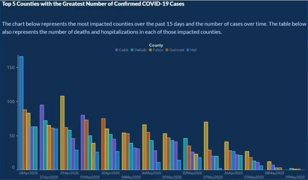
The above graph was on the Georgia Department of Public Health site and it shows the top 5 counties with the greatest number of confirmed COVID-19 cases. At first glance, it appears that their case counts have been on the decline. That’s great news! Except that it’s not quite correct. Look closely and you’ll see that the dates are not in chronological order.
I decided to do a little cut and paste project to put the dates back in chronological order. Disclaimer – I am not a graphic artist and realize this looks amateur.

The data in chrono order tells a bit of a different story. Someone was caught catfishing! I am a little impressed at their sort manipulation.
Note that this chart has since been corrected on Georgia’s site and they are now reporting data in chronological order.
Even with my fabulous cut and paste effort, it’s still hard to look at each individual county because they change order with each set. And the last 2 days seem incomplete and should be excluded from this visualization in my opinion. Georgia’s Department of Public Health does have this disclaimer on their site:
Note – Data during the reporting period may be incomplete due to the lag in time between when the case was tested and/or reported and submitted to the Georgia DPH for reporting purposes. This delay can vary depending on the testing facility and/or jurisdiction.
I also found their choice of a dark background a little distracting. I wanted to recreate this graph in Tableau. Unfortunately, the data wasn’t available on Georgia’s Department of Public Health site at the DAILY grain. They did list their data sources:
- Persons Under Investigation (PUI) Data provided by Georgia Department of Public Health (DPH)
- Laboratory Testing Data provided by DPH
- United States Census Bureau
But I couldn’t quickly figure out their methodology for joining the datasets. Given I just wanted to see the visualization a bit differently, I decided to visually estimate the data points for the top 5 counties for each day. I also excluded the last 2 days since they’re incomplete.
HUGE DISCLAIMER – this is not the official data but my own approximation just for the sake of doing my own mini make-over:

Even with the white background, I’m still distracted by the clutter. I have a hard time seeing the trends for each individual county. I don’t think a bar graph is the right choice for communicating the county trends.

The line graph appears to be the better choice here.
Just remember, it’s so important, especially in a public health crisis, to report the numbers accurately and with transparency. It’s also imperative for us consumers of data visualizations to look closely at the axis!!

Leave a comment